What is a scroll-driven section?
The scroll-driven section in Lapis is an immersive format, where content such as images, text, and data visualisations are gradually revealed when the user scrolls their mouse. This is also known as scrollytelling.
Visual examples of scrollytelling
Abandoned at Sea, Kontinentalist
This is an example of a scrollytelly that uses illustrations to accompany text, to build context and the human aspect the story.
Transboundary Haze in Southeast Asia, Kontinentalist
This is an example of using scrollytelling to break down information in the data visualisation, so that the readers can take in one bit of information at a time.
How to use the scroll-driven section?
Step 1: Choose your layout
In Lapis, you can choose between a 2-Panel and Overlay layout.
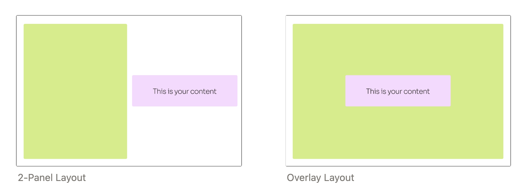
The main difference between the options is where the content is placed. In a 2-Panel layout, the content and media are placed side-by-side, which is good for breaking down information into stages. On the other hand, in the Overlay layout the content sits on top of the media. The full-screen media results in a more immersive look, but it also means that visibility of the media is partially obstructed. Hence, choosing the right layout is important for readability and should be in line with the purpose of your story.
Going back to the story examples above, Abandoned at Sea uses the Overlay layout to build a more engaging reading experience, while the story on Transboundary Haze uses the 2-Panel layout to ensure clarity in the data.
Step 2: Understanding the components of the scroll-driven section
Hierarchy of components:
- Slide (You can stack multiple slides)
- Media (Limited to 1 per slide)
- Content (You can add multiple per slide)
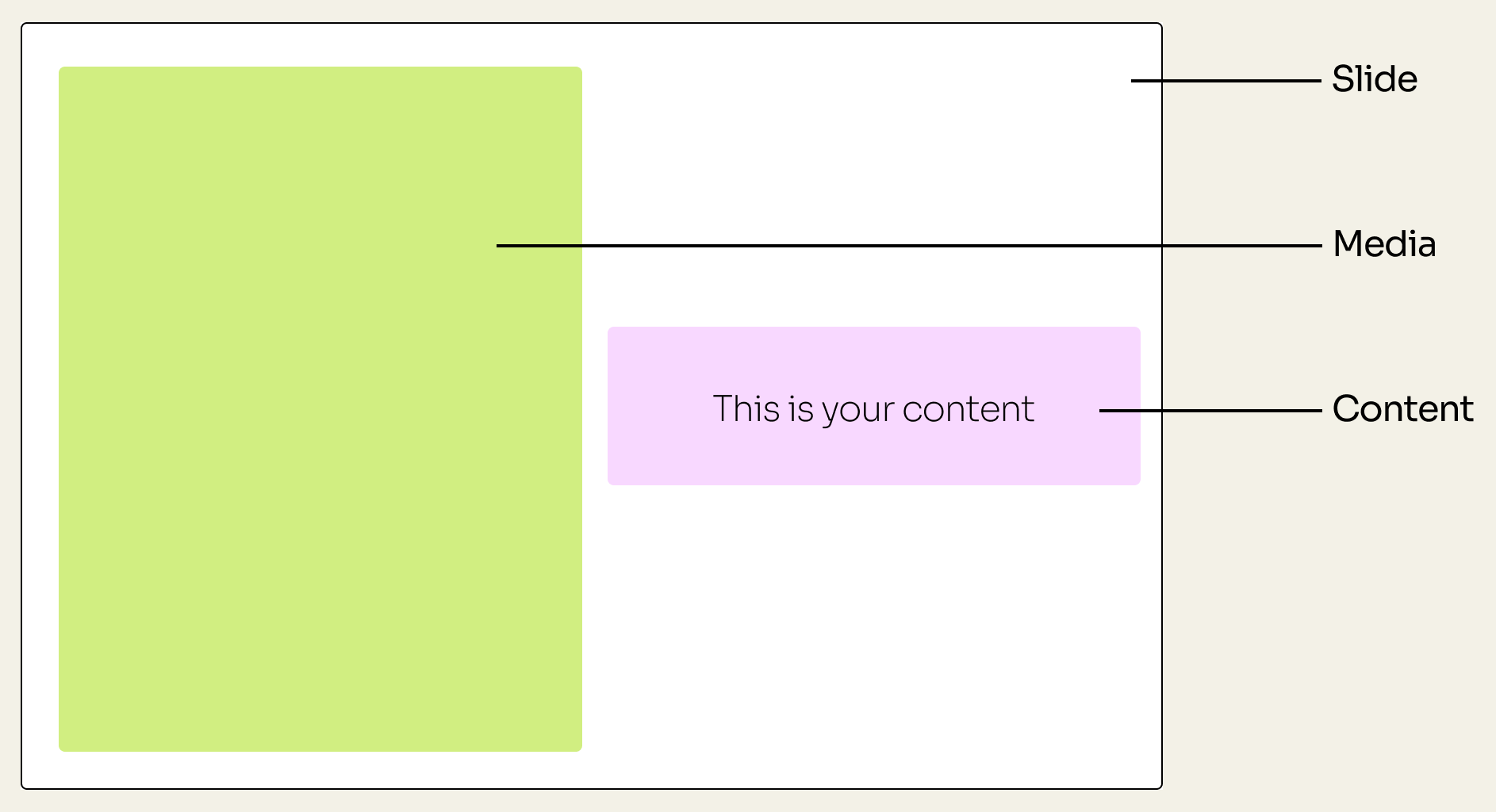
The main point of a scrollytelly is to show how the Content relates to the Media. For example, explaining some findings behind a dataset or an image. So you can think of each Slide as a frame for your Media, and it helps to wrap whatever Content (text, images, etc) you might need to help explain the Media.
Step 3: Understanding how the components will move and work together
Now we know what a slide is, let’s talk about the different scenarios when you choose to add multiple content panels, and multiple slides.
Adding multiple content panels
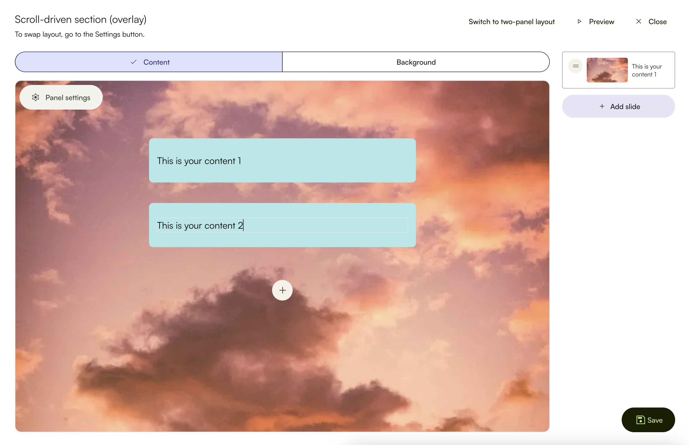
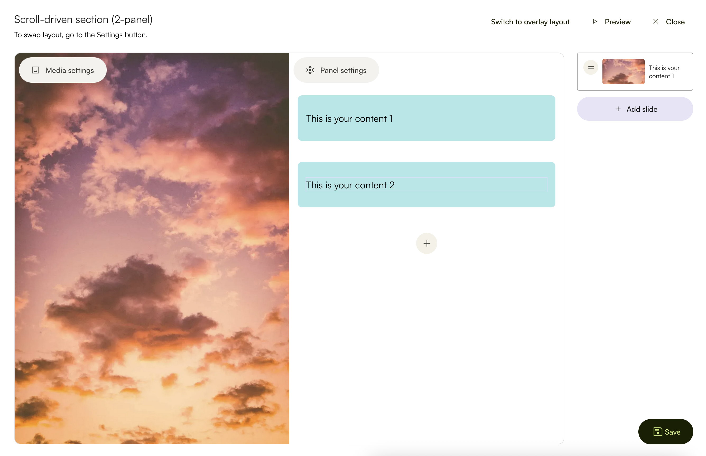
When you add multiple content panels to the same media, this means that when your reader scrolls, the image will remain in place while your content boxes will scroll into the page.
Overlay with multiple content panels
What it looks like in the storybuilder:
How the final results look:
Two-panel with multiple content panels
What it looks like in the storybuilder:
How the final results look:
You can use the grey + button below your content boxes to add more. You can also drag the content boxes around to rearrange the order of your content.
Adding multiple slides
Using multiple slides is useful when you have more than 1 piece of media to introduce in your scroll-driven section. Having multiple slides mean that both your content and media will change as the user scrolls. Just like the story example ‘Abandoned at Sea’, the illustrations in the background changed alongside the text.
What it looks like in the storybuilder:
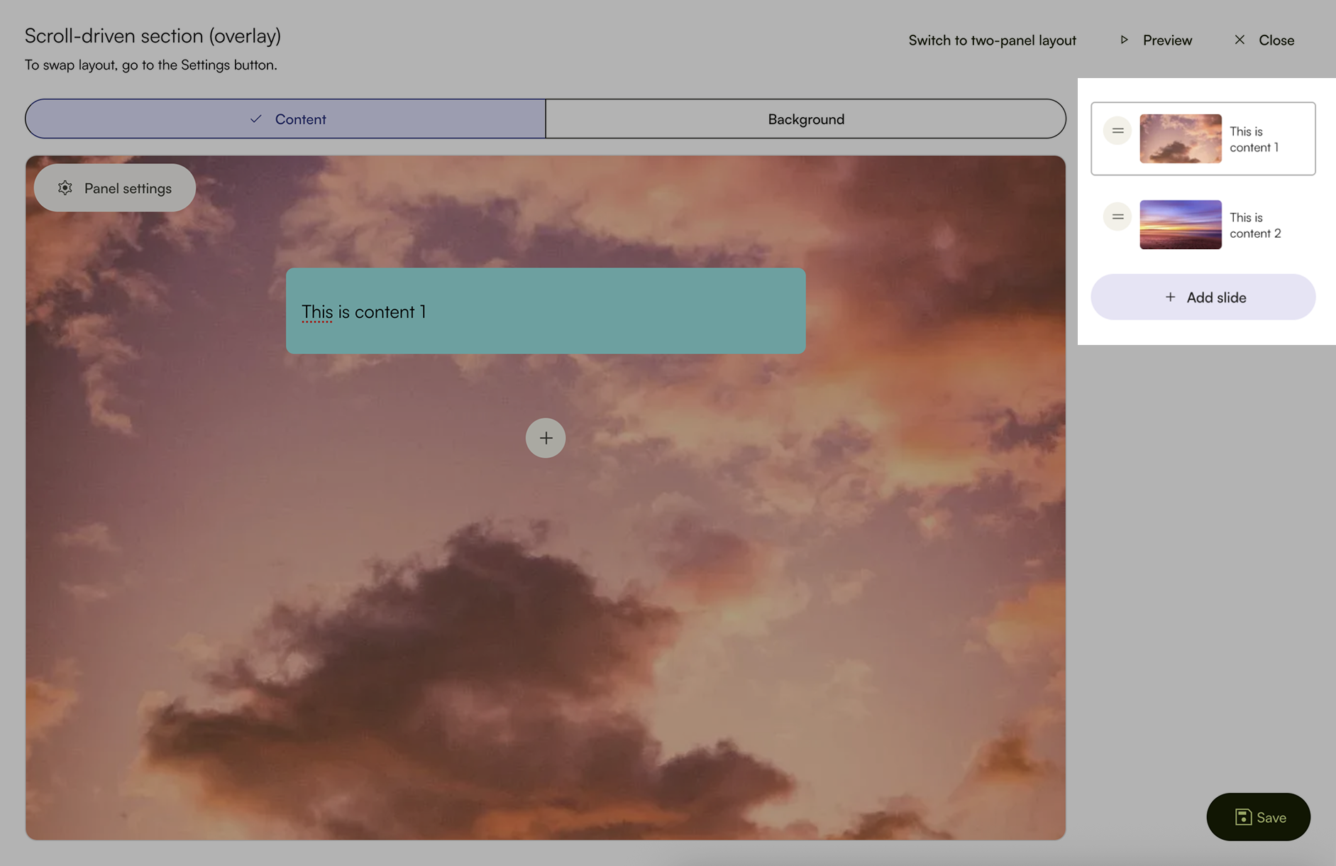
What the actual effect would be:
Overlay with multiple slides
Two-panel with multiple slides
In both the 2-Panel and Overlay, slides can be seen on the right side of the screen. You can click + Add slide to add more. You can also drag to rearrange them.
Step 4: Customising your scroll-driven section
To customise the scroll-driven section, click on Panel settings
There, you will have options to customise:
- Layout (only available for the 2-Panel Layout)
- Scroll transition
- Content panel design
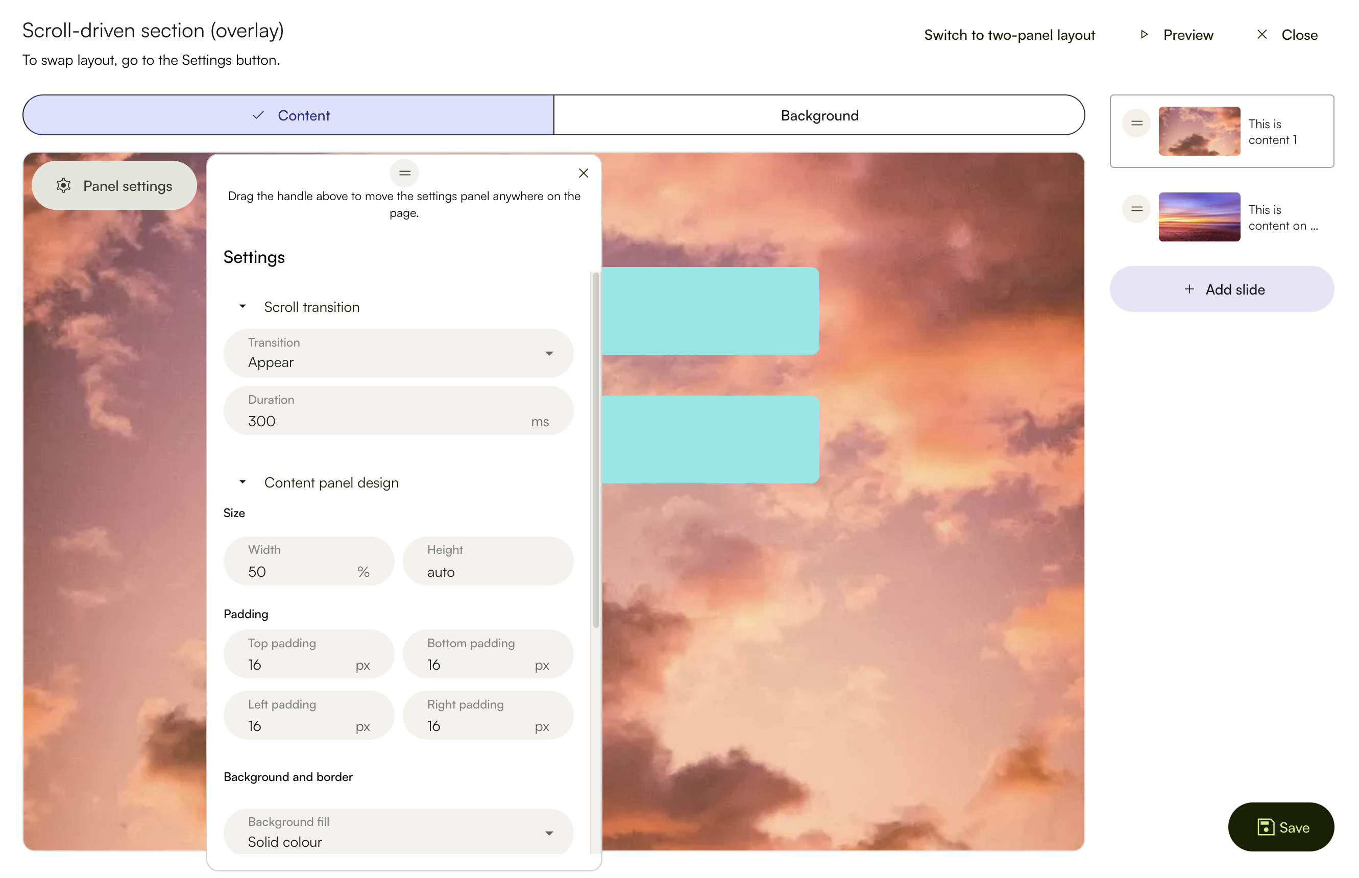
Settings for Overlay Layout
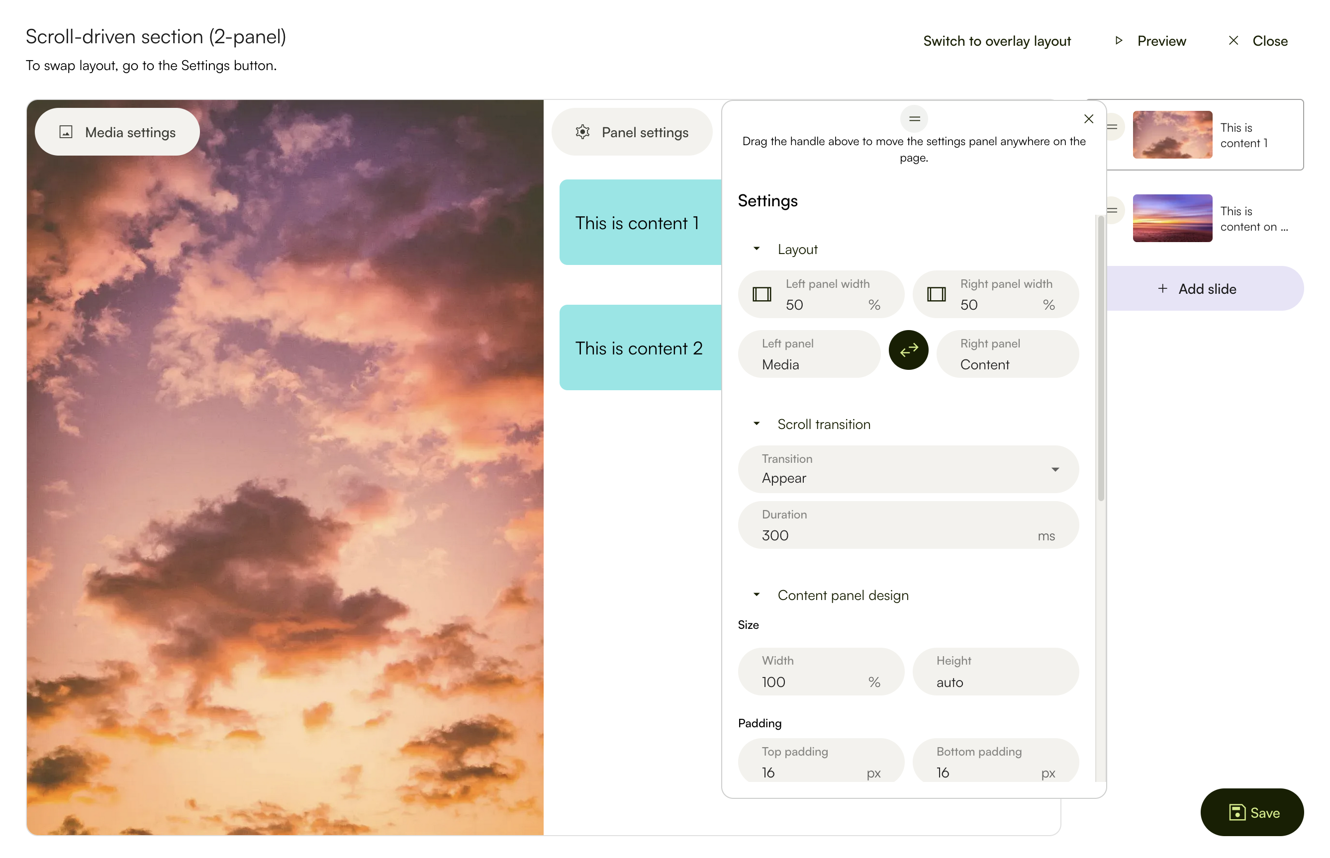
Settings for 2-Panel Layout
There is additional explanation on the scroll transition below.
Customising the layout (only available for the 2-Panel Layout)
By default, the 2 panels are set to the same width, by giving each 50% of the total screen size. You can edit the percentages to suit the look of your story, for example giving the media 70% and the content box 30% of the screen width.
You can also use the black icon button to swap the placement of the media and content. By default, media is placed on the left panel. But you can swap it if you prefer your media to be on the right instead.
The layout is flexible and customisable based on how you envision your story to look like.
Customising the scroll transition
In Lapis, we have options on how you want your content to appear. In the examples above, we used a simple Fly in and out. But you can also select Appear for the content to switch out, if you don’t like the look of the content boxes moving across the screen.
Fly in and out
Appear
You can also set how fast or how gradual the change happens. The default is currently set to 300ms. If you decrease the value to something lower, like 100ms, this means that the animation/transition will happen faster. If you increase the value to 500ms, this means the transition will happen slower.
Customising the content panel design
The content panel can also be freely customised to suit the aesthetics of your story.
Size: Width of your content panel
You can adjust the width of the content under Size, by typing in a new percentage value. We use percentage instead of other units of measurement as it is the most visceral and intuitive for most users.
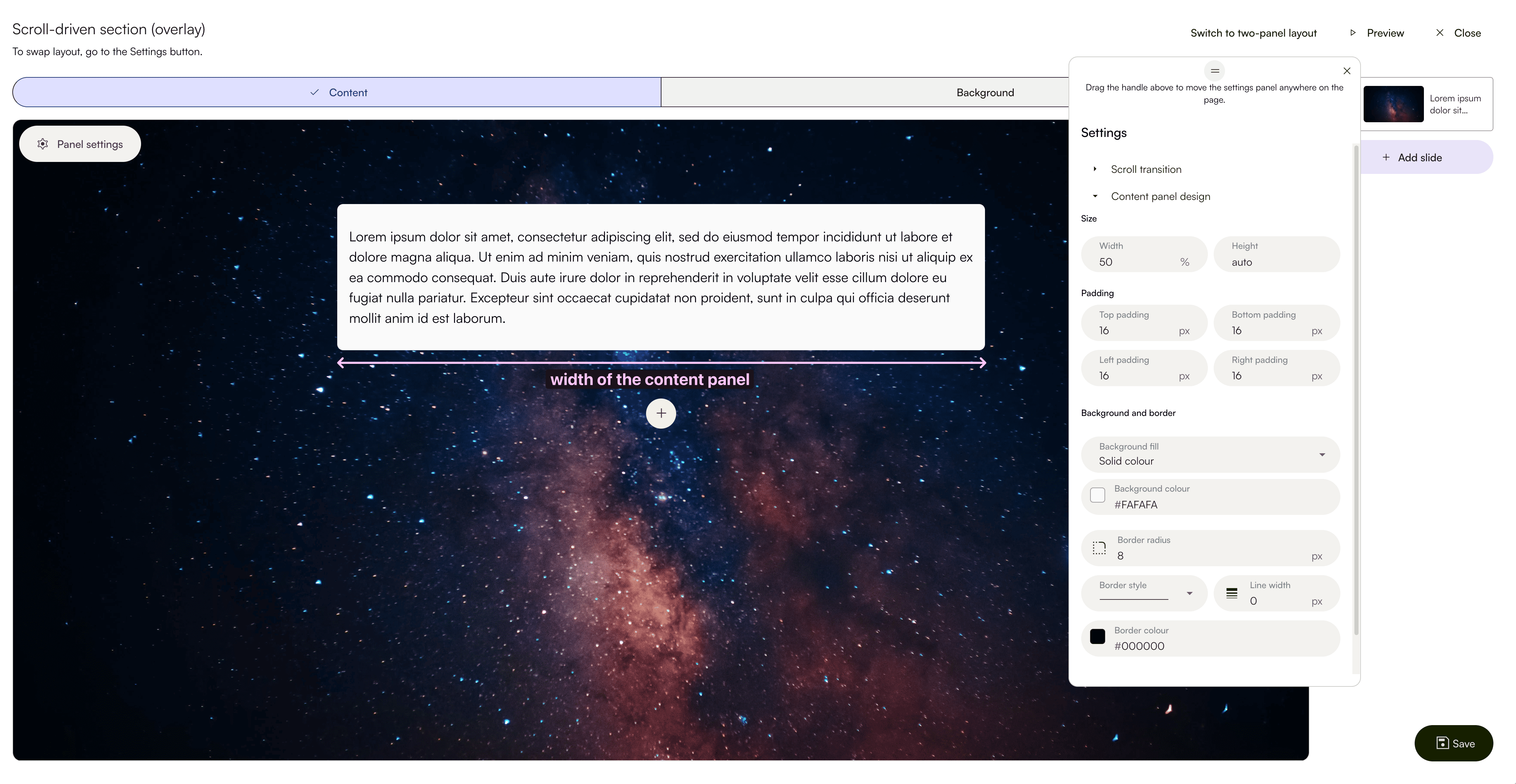
Height is set to auto, which means that the text box will follow the amount of content that you have. There is no limit to this, but we encourage you to not overload each slide with heavy content.
Padding: The space around your content
By default, we have set the padding to be 16px. However, you also have the flexibility to design how you want your content boxes to look. For example, if you prefer more space on the sides, you can increase the value for left and right padding.
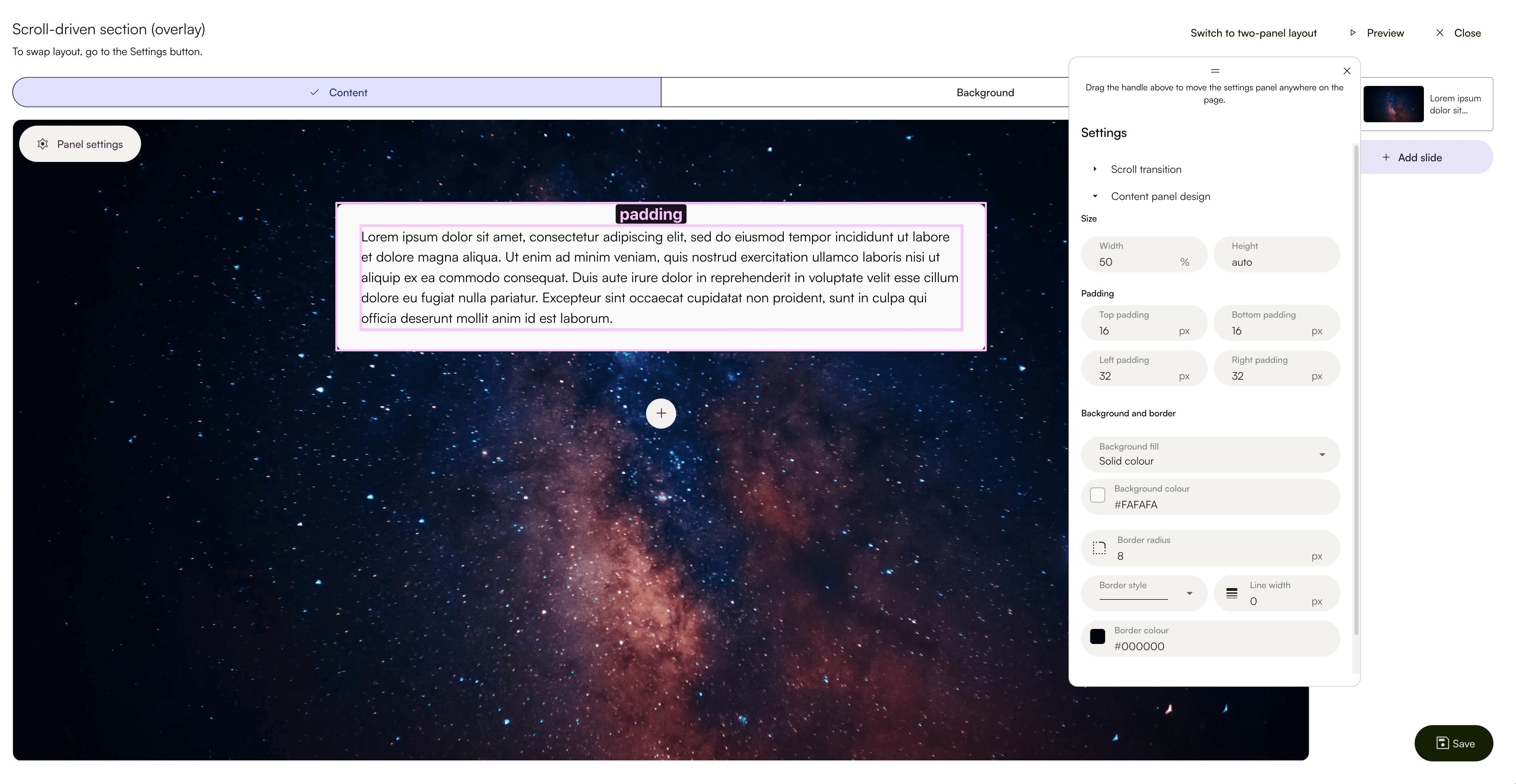
Padding is important as it creates a visual breathing room and helps make the design look more polished and friendly to read.
Background and Border
Under background, you can choose to the following options:
- Solid colour: Allows you to input a colour code and your background for all content panels will be that specific colour.
- Background image: Allows you to create more advanced designs, for example using a dotted grid pattern to mimic text over a notebook.
- No fill: This means that your text will sit directly over the media, with no additional background box visible.
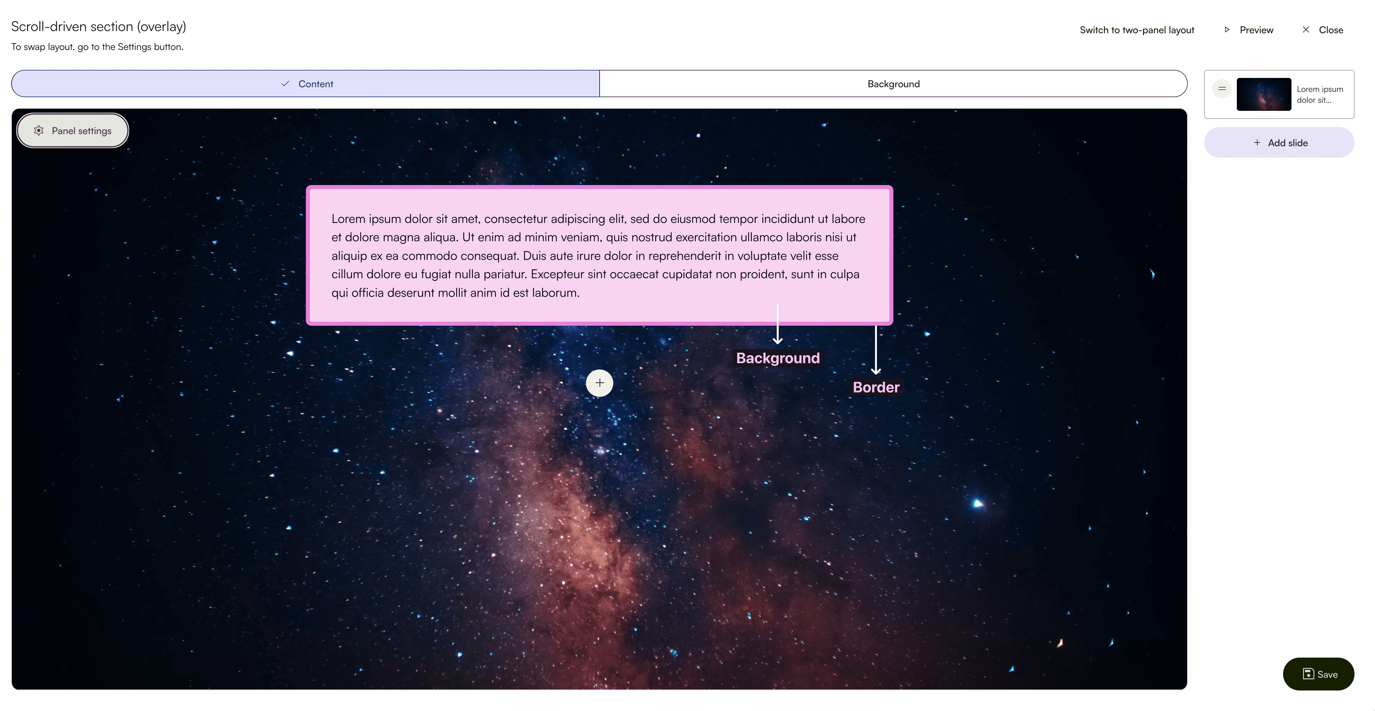
For borders, the default line width is set to 0px. In order for a border to show up, you will need to change this value first. Thereafter, you can tweak other properties such as the line colour, style, and even on specific sides you want the border to be on.
Border radius can also be adjusted to create curved corners.
Step 5: Previewing and saving your scroll-driven content block
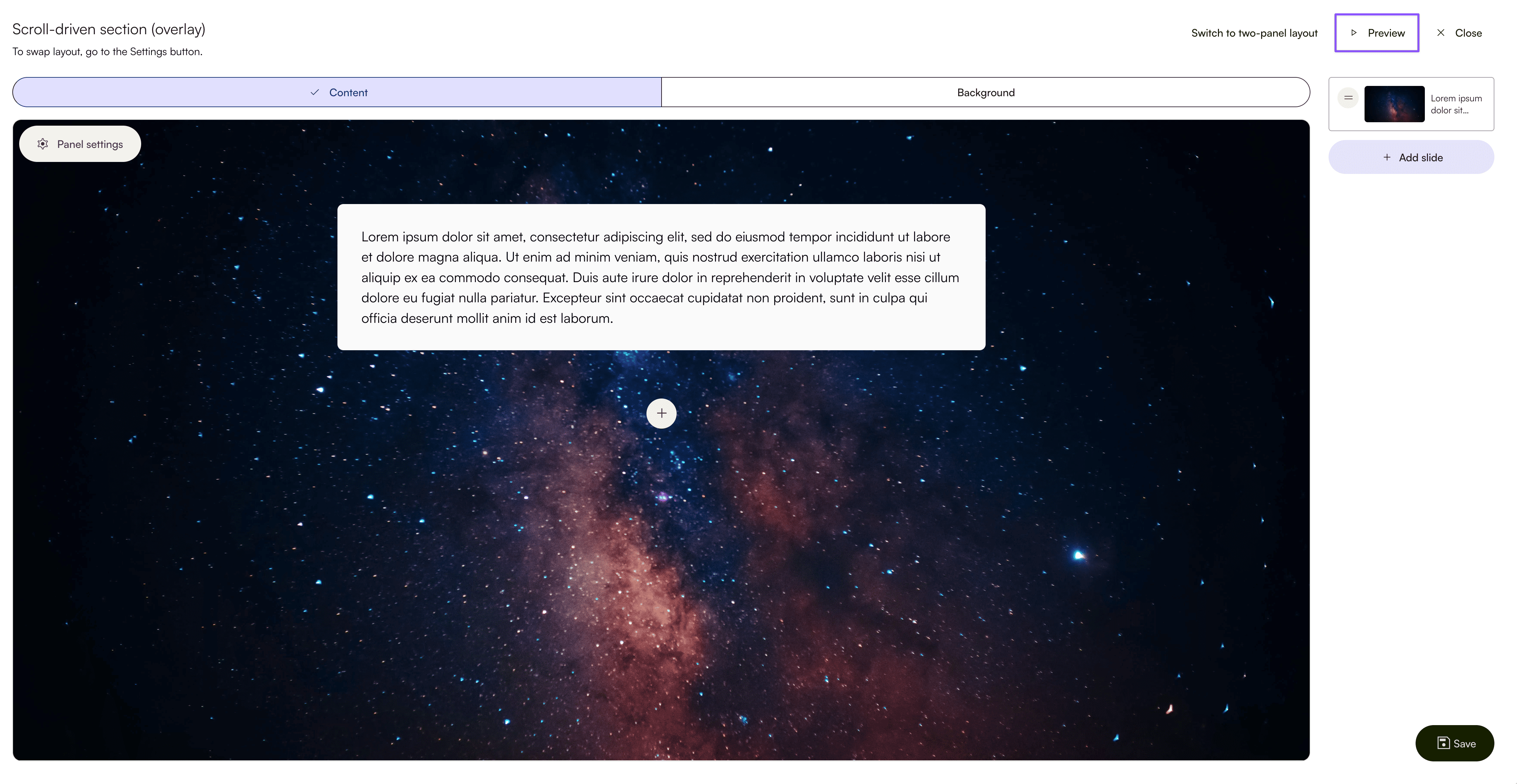
To preview your scroll-driven content block, click Preview at the top right corner of the editor. You can preview your scroll-driven content block without leaving the editor.
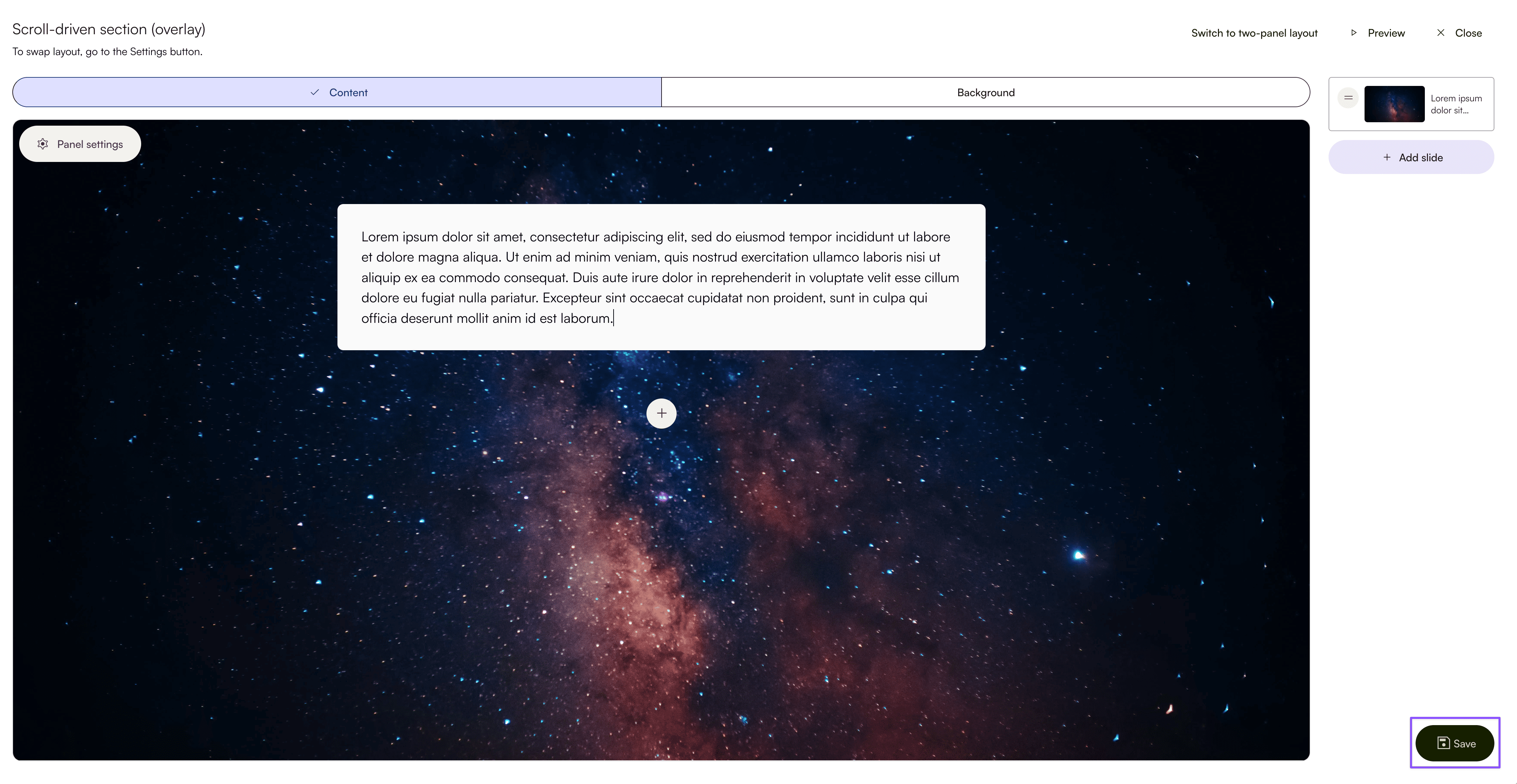
To save your scroll-driven content block and add it to the canvas, click Save at the bottom right corner of the editor. You will exit the scroll-driven content block editor and return to the storybuilder canvas.
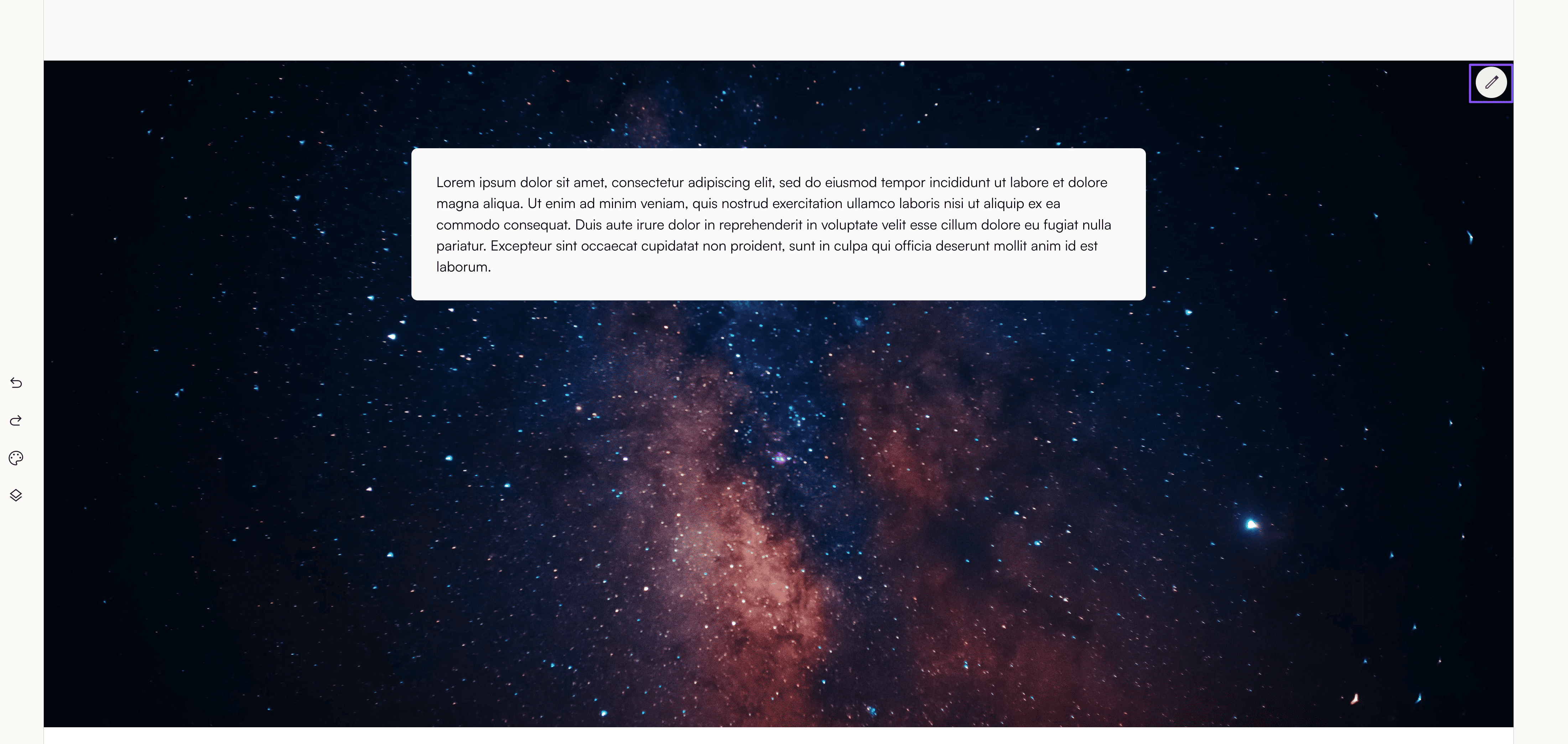
To make further edits and adjustments to the scroll-driven content block you already saved, click the pencil icon at the top right corner of the content block. It opens up the editor again.
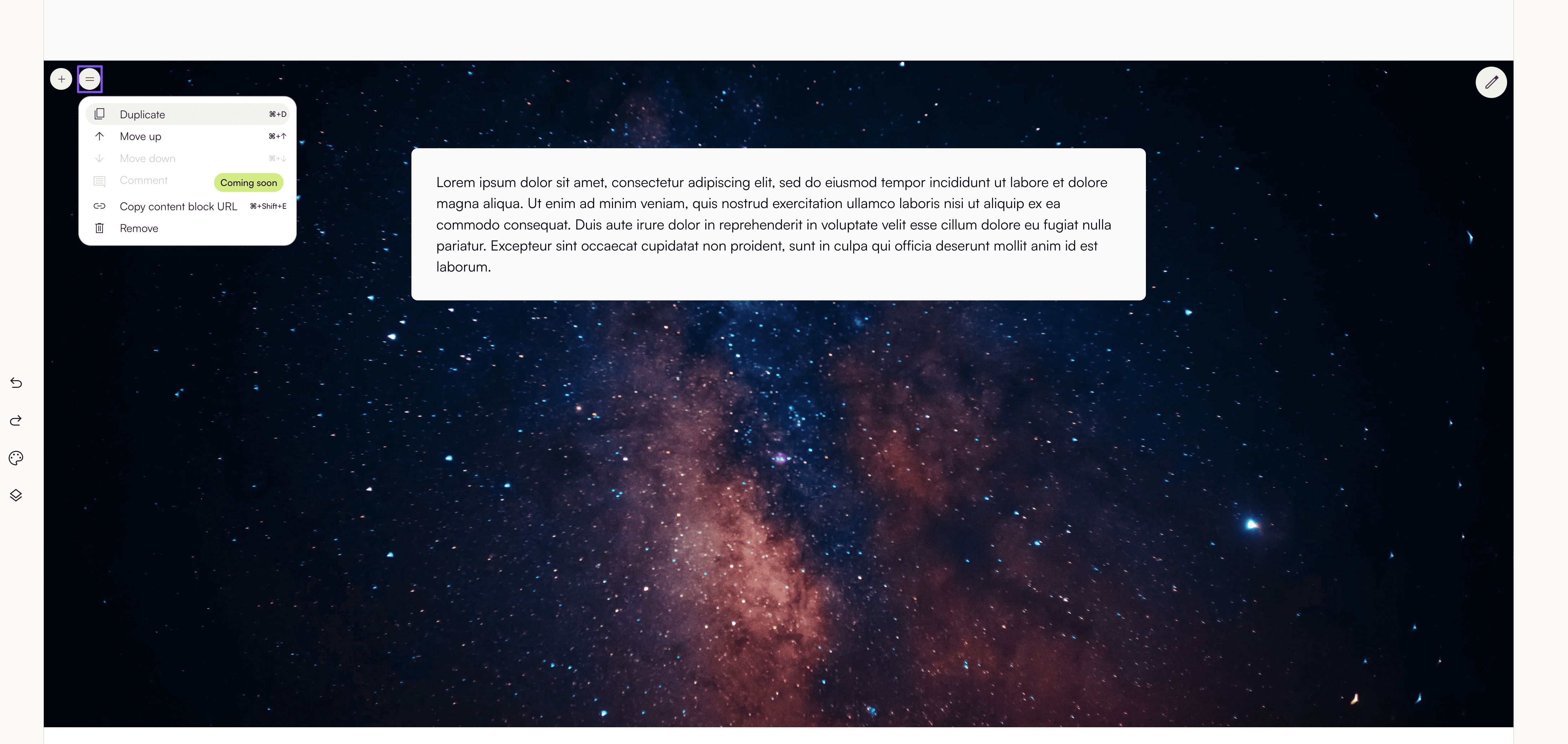
Scroll-driven content blocks function like any other content blocks. You can remove, duplicate, and rearrange it.
Congratulations! You just created a scroll-driven content block. Experiment with timing, pacing, and reveal to find the right rhythm for your story and engage your readers.
Was this article helpful?
That’s Great!
Thank you for your feedback
Sorry! We couldn't be helpful
Thank you for your feedback
Feedback sent
We appreciate your effort and will try to fix the article