Section vs Content Block
Content blocks
In Lapis, a content block is the basic unit of a story. Each block holds one type of content, for example, text, image, video, audio, data visualisation, or other interactive element. By varying content block types in a single story, you can vary how you present your information and engage your audience, rather than relying on text alone.
Sections
A section is a container that holds one or more content blocks. Some sections determine how readers move through that part of the story. For example, by scrolling or clicking. A new section signals the start of a new chapter or content grouping.
Sections
Blank Section
What is it?
A blank section is essentially a frame that wraps content blocks, so that you can design visually distinct sections throughout your story.
When is it best used?
The blank section is best used for
- When you want to have a different background colour for a section in the story or even a background image that text can sit on top of.
- Organising content sections, so that you can shift the entire section around the story easily
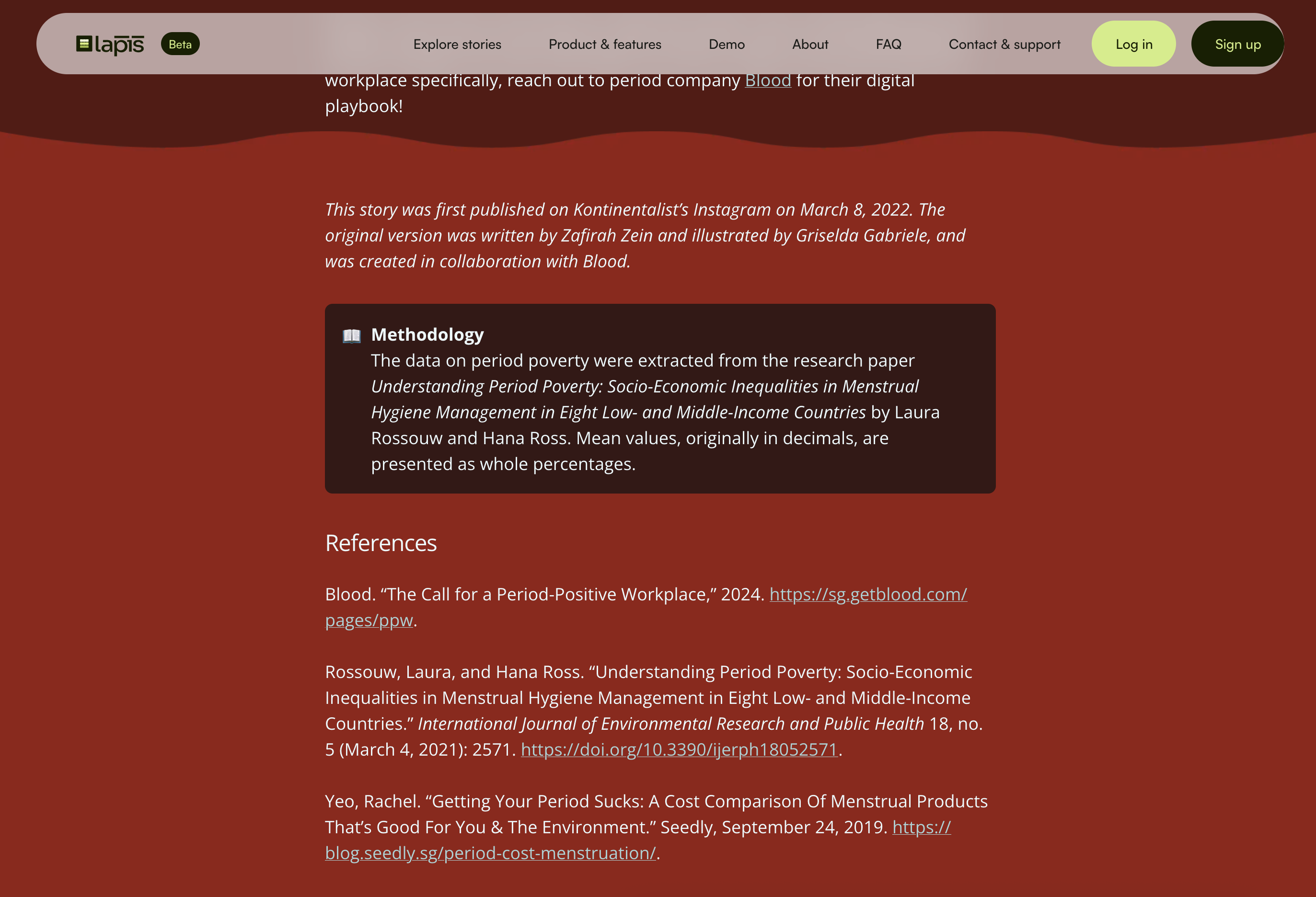
- Separating your methodology and references from the main body of the story
When not to use it?
Avoid using the blank section to wrap only a few content blocks that are part of a larger section. This can break up the content oddly and confuse readers.
When to make it effective?
The blank section is not visible by default, so you can exercise your creativity and design the section so that it stands out and is visually distinct from the rest of the story.
What are some examples?
Use it to highlight your methodology and references
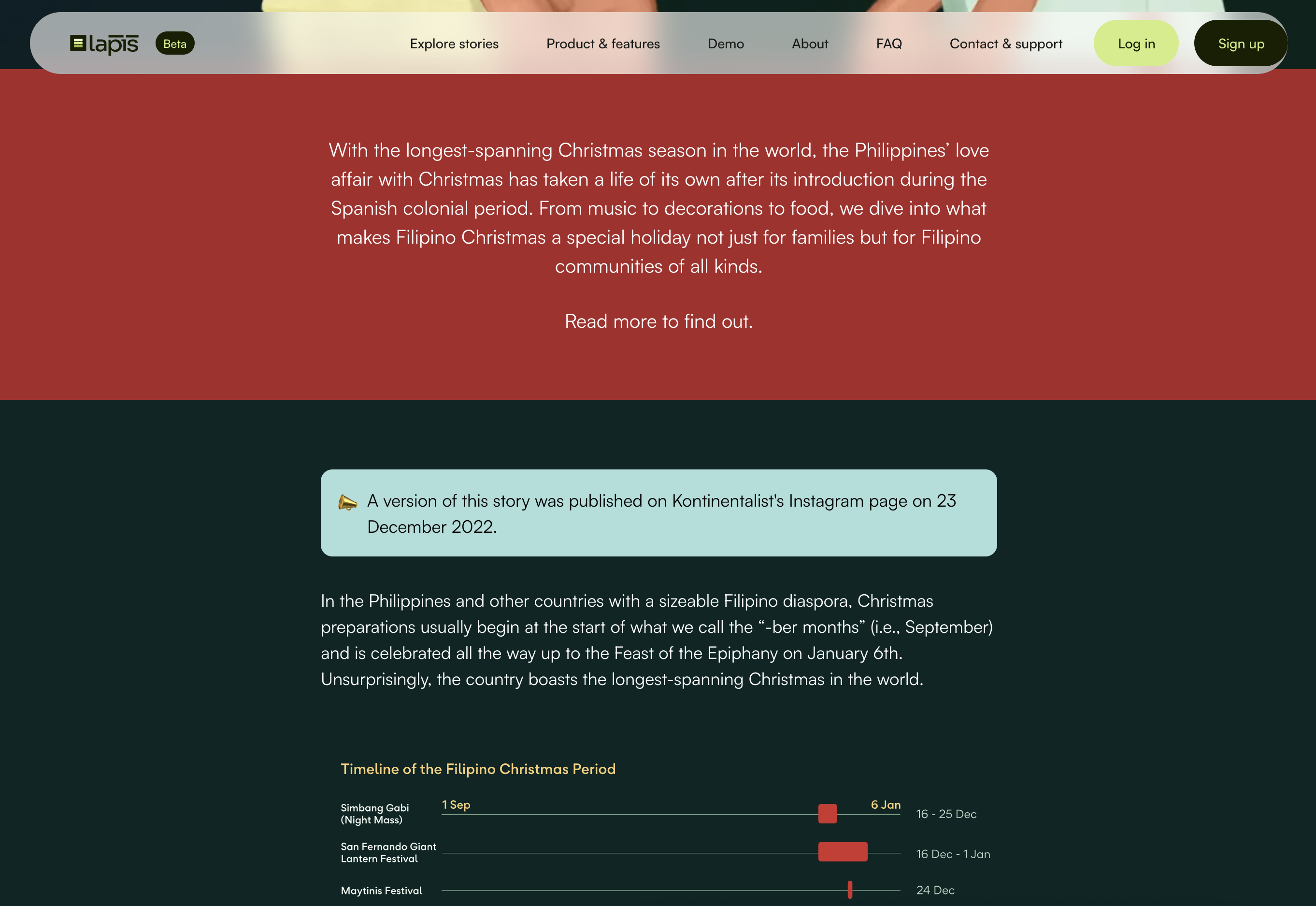
Use it to differentiate sections of your story to prevent visual monotony
Text-based content blocks
Boxed Text
What is it?
The boxed text content block can be used to highlight supplementary information readers may find useful while engaging with a story. It helps separate contextual content from the main narrative, making it easier to scan and reference.
When is it best used?
The boxed text is best used for:
- Instructions for interactive charts, maps, or visualisations
- Key takeaways or summaries
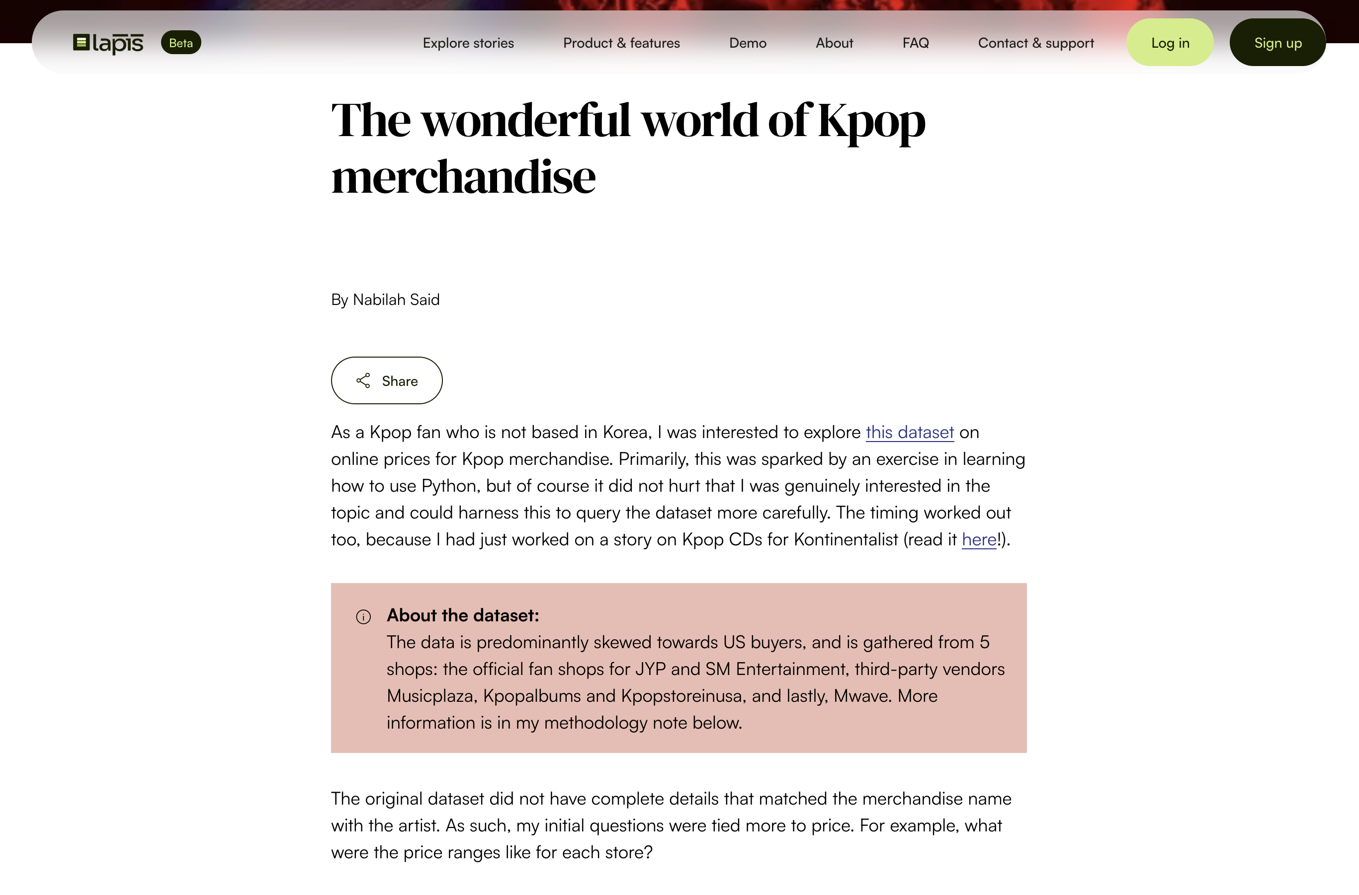
- Brief contextual methodology notes to explain how data was collected or used
- Definitions and explanatory context
- Important caveats or limitations
- Additional background information
When not to use it?
Avoid using the boxed text when:
- The information is essential to understanding the story and should appear in the main body
- The content is lengthy or contains multiple sections, for example your full methodology and references
- The box becomes a dumping ground for unrelated information
When to make it effective?
To ensure that your Juxtapose content block achieves its intended effect:
- Keep content concise and focused on a single purpose.
- Use clear headings such as "How to read this chart", "Instructions for interactive map", or "Key takeaway".
- Limit content to a few short paragraphs or bullet points.
- Ensure readers can continue the story without needing to read every boxed text block.
What are some examples?
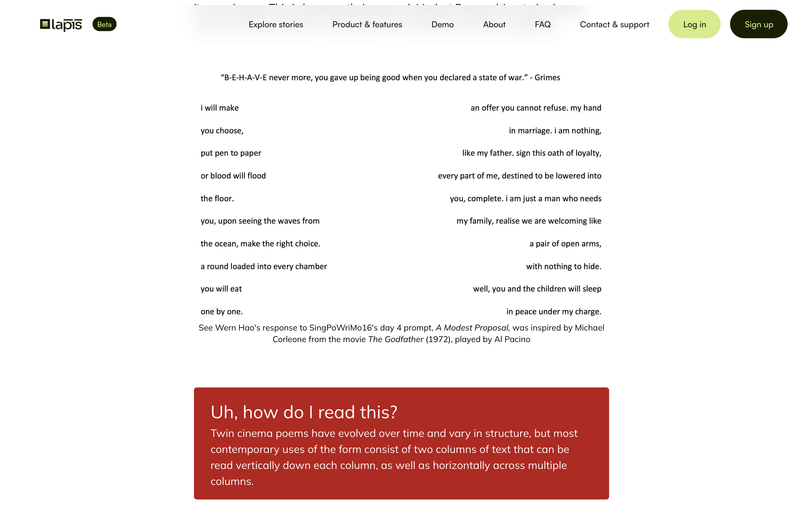
Use the boxed text to highlight guides that help readers understand or interact with a visualisation.
Use the boxed text to briefly describe data sources, time periods, or analytical approaches.
Use the boxed text to provide definitions, historical background, or additional explanation for readers who want more detail.
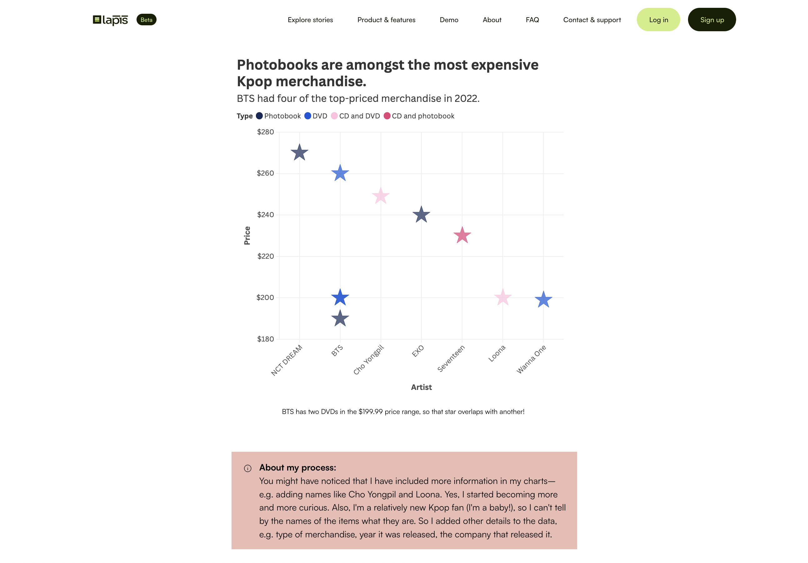
Image-based content blocks
Image Grid
What is it?
An image grid lets readers view a collection of images at once. It works well when your story has multiple images that build context and understanding of the topic.
When is it best used?
Use an image grid when the collection of images has a theme or central message.
When to make it effective?
- Ensure that the images have the same treatment. If you use stock images, apply the same filter for all the images so that the lighting and colour will look like they belong together.
- Ensure that the images are of similar size and resolution.
- Try not to use more than 6 images in a grid, as it will become a long list on smaller devices, such as your phone screen.
What are some examples?
Use the image grid to showcase visual examples or case studies.
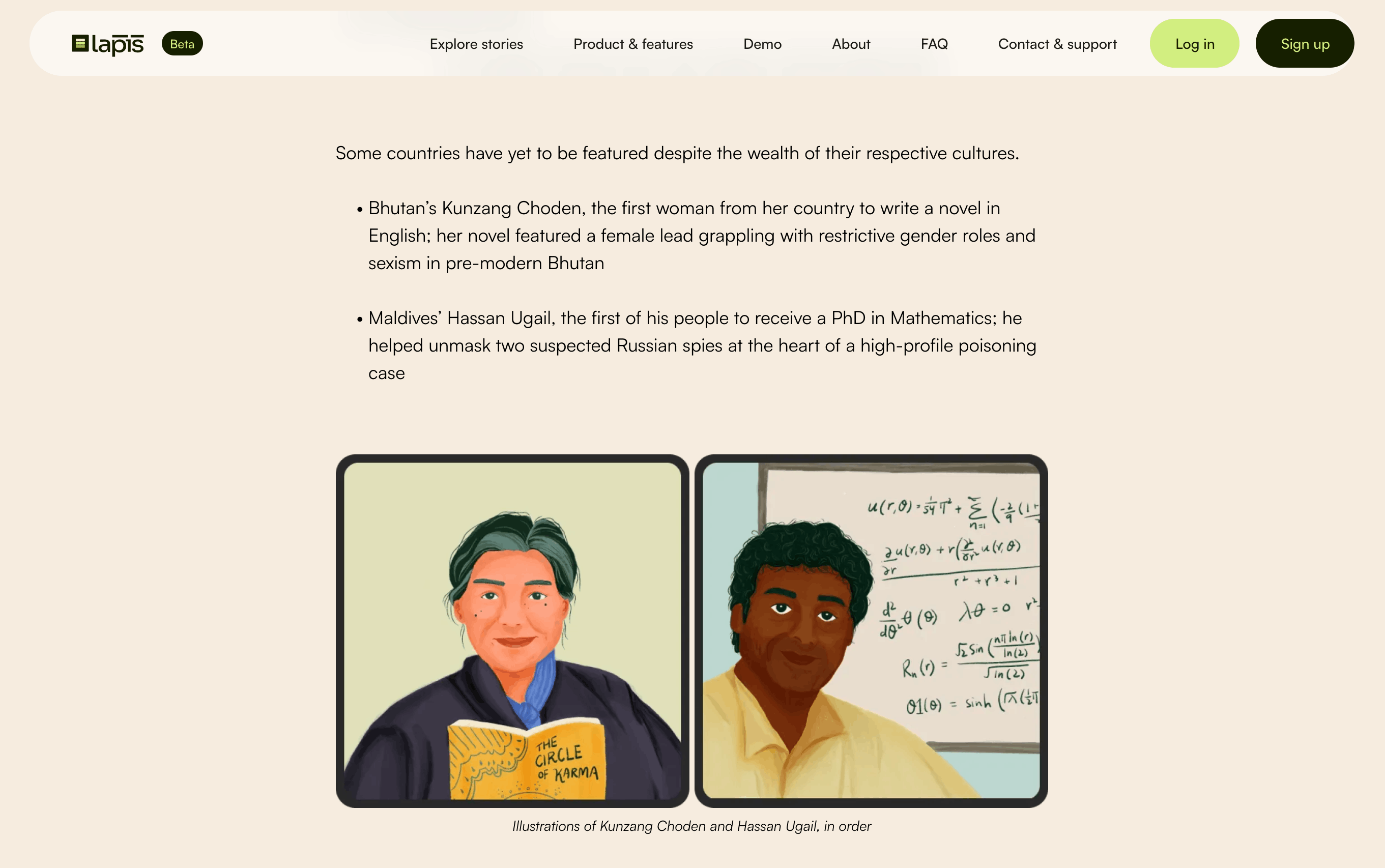
Use the image grid to showcase images that relate to the same theme.
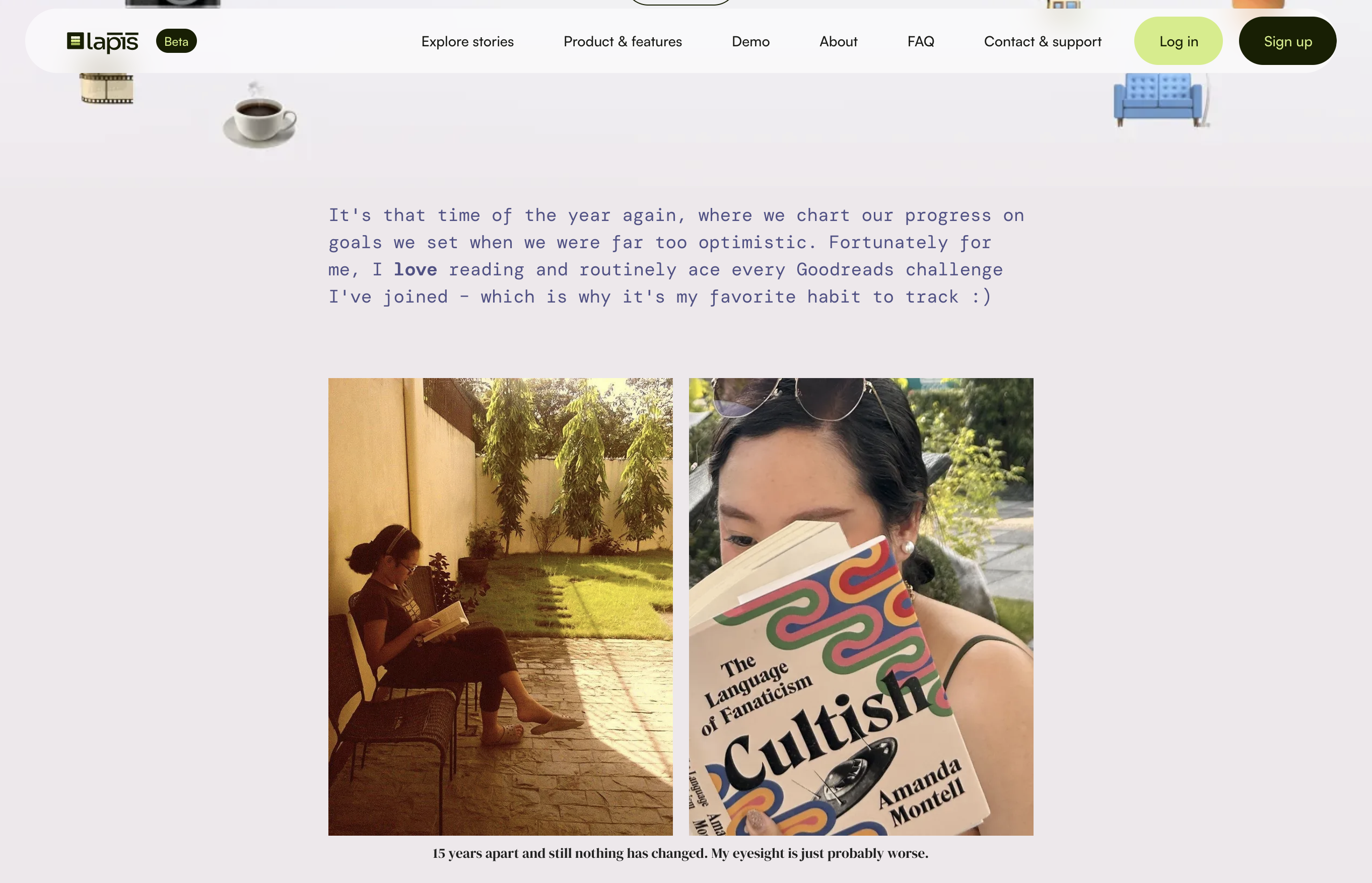
Image Carousel
What is it?
Image carousel allows you to showcase a collection of images that are related to the story, but not imperative to show.
When is it best used?
- Showcasing images as a visual break in the story
- Showcasing a list of visual examples
When not to use it?
- When the images are an important part of understanding the content. This is because a carousel requires the reader to click through the gallery of images, which not every reader will do so. Hence, it should be reserved for image content that can add to a story, but is not necessary to the understanding of the story.
When to make it effective?
- Ensure that the images are of the same size and resolution
- Add captions below each image to highlight the main message
Image Juxtapose
What is it?
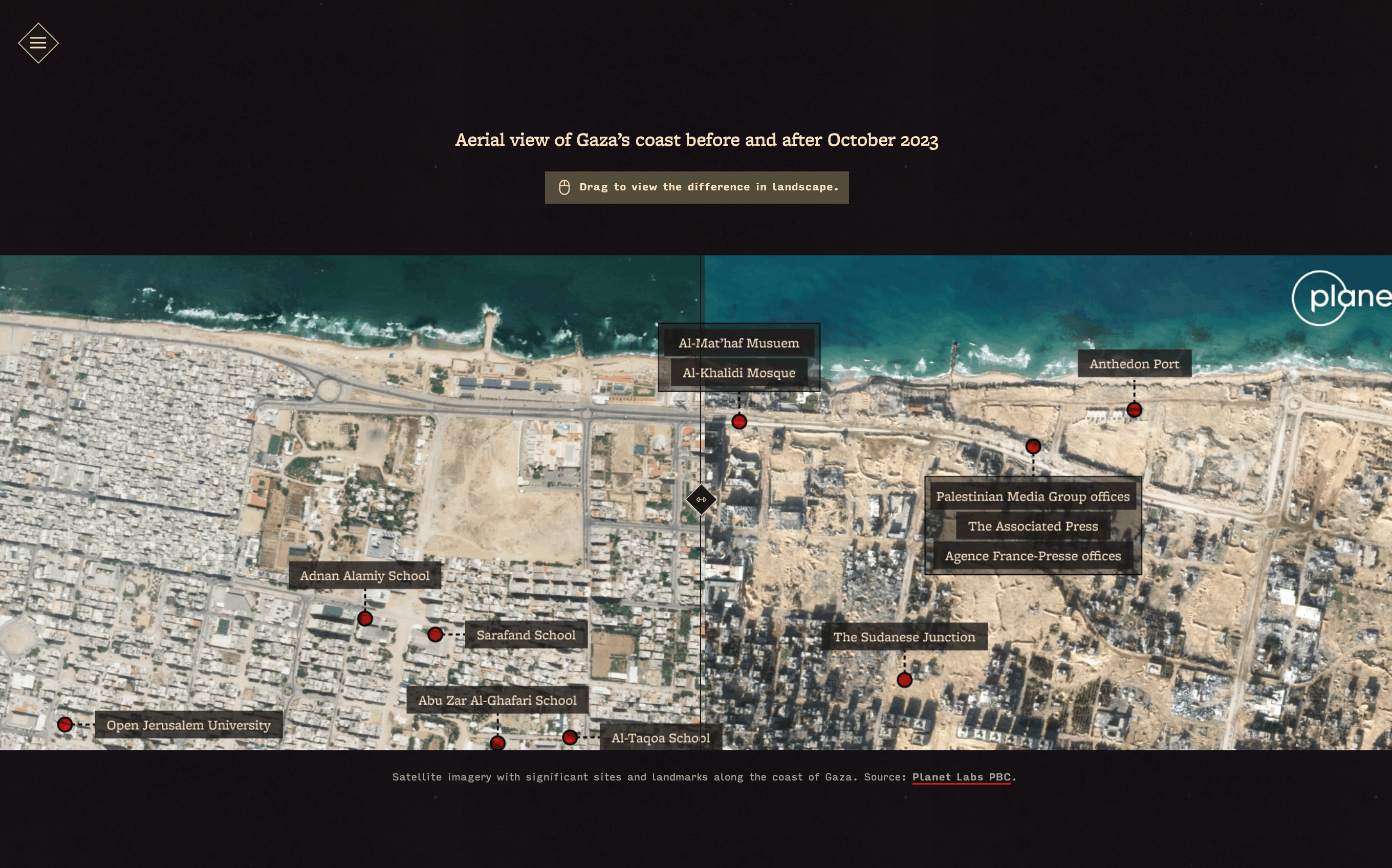
The juxtapose content block allows readers to compare two images using an interactive slider. It is most effective when the story's key insight comes from seeing visual differences between two related images.
When is it best used?
Juxtapose is best used for:
- Before-and-after comparisons
- Changes over time
- Satellite or aerial imagery analysis
- Environmental and climate reporting
- Urban development and infrastructure projects
When not to use it?
Avoid using the juxtapose content block when:
- Differences between images are subtle or difficult to spot
- More than two images need to be compared
- Images are poorly aligned or use different perspectives
- The comparison requires extensive annotation or explanation
When to make it effective?
To ensure that your juxtapose content block achieves its intended effect:
- Use images with clear, meaningful visual differences.
- Align images as closely as possible.
- Include a caption that explains what is being compared and why it matters.
- Ensure the main takeaway is understandable even without interacting with the slider.
What are some examples?
Use the juxtapose content block to make changes apparent. As long as the change is drastic enough, showing either positive and negative change is possible with the juxtapose content block.
Was this article helpful?
That’s Great!
Thank you for your feedback
Sorry! We couldn't be helpful
Thank you for your feedback
Feedback sent
We appreciate your effort and will try to fix the article